Web Performance Techniques - Fonts and Images
This article reflects on some recent work my team undertook to improve web performance on our pages. I’d like to share two areas that we made improvements in:
But first I want to cover something…
Web performance metrics and diagnosis of issues
These days, our Google search ranking depends on a number of things, and one of those things is Google’s concept of “Core Web Vitals”. These are a collection of metrics that Google came up with to assess websites and they are associated with user experience. Google is slowly evolving the metrics, but at this point in time they are:
- Largest Contentful Paint (LCP), i.e. how long it took for the largest bit of in-viewport content to become visible
- Cumulative Layout Shift (CLS), i.e. how much the page content moved around while the page loaded
- First Input Delay (FID), i.e. how long it took for the page to respond to the first interaction made by a user
First Input Delay (FID) will be replaced by Interaction to Next Paint (INP) as a Core Web Vital on March 12, 2024.
These not only improve our Google search ranking if we achieve good scores, but in theory they also mean our users will have a better experience on our websites.
There are many tools available online to help you assess the web performance of your sites. Typically these tools focus on Google’s Core Web Vitals metrics. I tried many of them and would recommend the following:
Google Search Console
Perhaps the most important view of all. GSC shows you the official report by Google on your website’s Core Web Vitals. These are the actual scores, assigned by Google, that are being used to influence our Google search ranking. I treat GSC as the ultimate place to identify areas of improvement and also to test/validate whether an improvement has been successful. That said, it doesn’t provide granular information about issues, which is where other tooling is needed.
Pagespeed Insights
This online tool is linked out to directly from GSC. It is hosted and maintained by Google and so I think we can safely say it is likely that the issues and opportunities it gives us will have a positive impact on the scores and reporting we see in GSC. It provides a report for your web page that allows you to see how it has been performing over a 28 day period on a variety of devices and network devices - data that is collected from real users around the world as part of Google CrUX. It also shows you a single report for a test carried out on demand and provides you with a detailed list of opportunities for improvement. All in all a very good tool.
SpeedCurve
Whilst other tools are free, this is a tool that Springer Nature pays for, and it is more comprehensive. It uses WebPageTest under the hood to provide a fantastic breakdown of the web performance on your web pages. It is more of a fully featured toolkit, allowing you to inspect all aspects of web performance on your pages, and allows you to inspect the underlying WebPageTest reports as well. You are also able to setup regular reports and notifications/alerting using SpeedCurve. Similarly to Pagespeed Insights, SpeedCurve also provides you with a list of potential opportunities to dig into. If you work at Springer Nature, speak to the Frontend Enablement team if you’re interested in using SpeedCurve on your project in the #ask-frontend-enablement Slack channel.
Fonts
Last year, Frontend Enablement did some excellent work producing an analysis of the web performance for one of the websites our team looks after. They provided recommendations that helped us understand areas of potential improvement. One of those areas was web fonts — specifically that the loading times of our pages was being impacted by the fonts that users had to download, which was blocking on the critical path. Consequently, it meant that we had LCP metric scores that were in need of improvement.
Note - we set cache control headers on http responses for font files so that browsers cache the fonts we use for a year. But many users are first time users, and much of the data used to assess our website is derived from first time visit.
Here are remedies that we implemented to improve things:
Font Subsetting
TL;DR - instead of users loading whole fonts, users only load the parts of the fonts (the character sets) they need for that particular page and its content. This means the font files downloaded are smaller, lessening the blocking time during page load for a user.
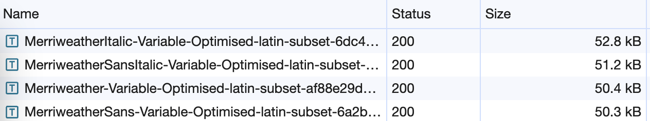
These were the results at the end of this piece of work:
An article page on our SpringerLink website
Before:
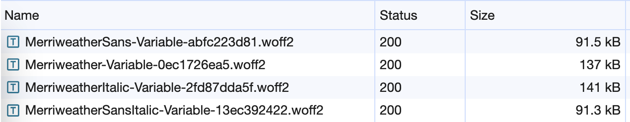
After:
A journal page on our SpringerLink website
Before:

After:

In order to carry out this work the following tools were used:
- Slice to optimise the source variable TTF font files
- Glyphhanger to subset the font files
- Font Drop to assess and manually/visually test generated font files
Note - the following technique is not compatible with the preloading font technique (<link rel="preload"). It is likely that this technique will bring you better performance gains compared to preloading fonts, but weigh it up for yourself.
Here’s a step by step description of what I did:
Step 1 - optimise your source font file before you start subsetting it
Think about how you use your fonts. For example, what font weights are you using in your CSS?
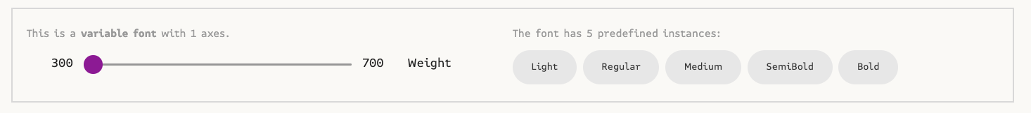
Can you reduce the number of font files you need by using a “variable” font file?
In our case, I realised that we currently only use font weights 300, 400 and 700. So I used the tool Slice to optimise the font file to remove unnecessary font axes and limit the range of weights needed from 300 - 900 to 300 - 700. This significantly reduced the size of the baseline font files that we can then start subsetting.
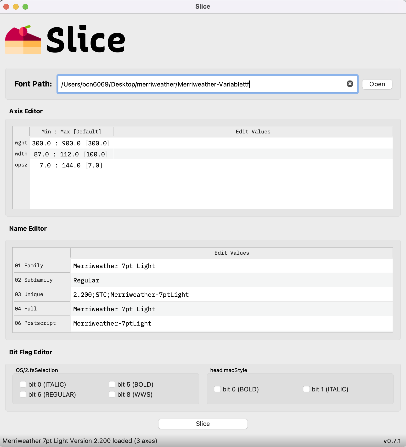
The above screenshot shows that the original font had wght, wdth and opsz axes defined.
You can use the tool to remove anything you don’t need, and in my case I removed wdth and opsz, ending up with:
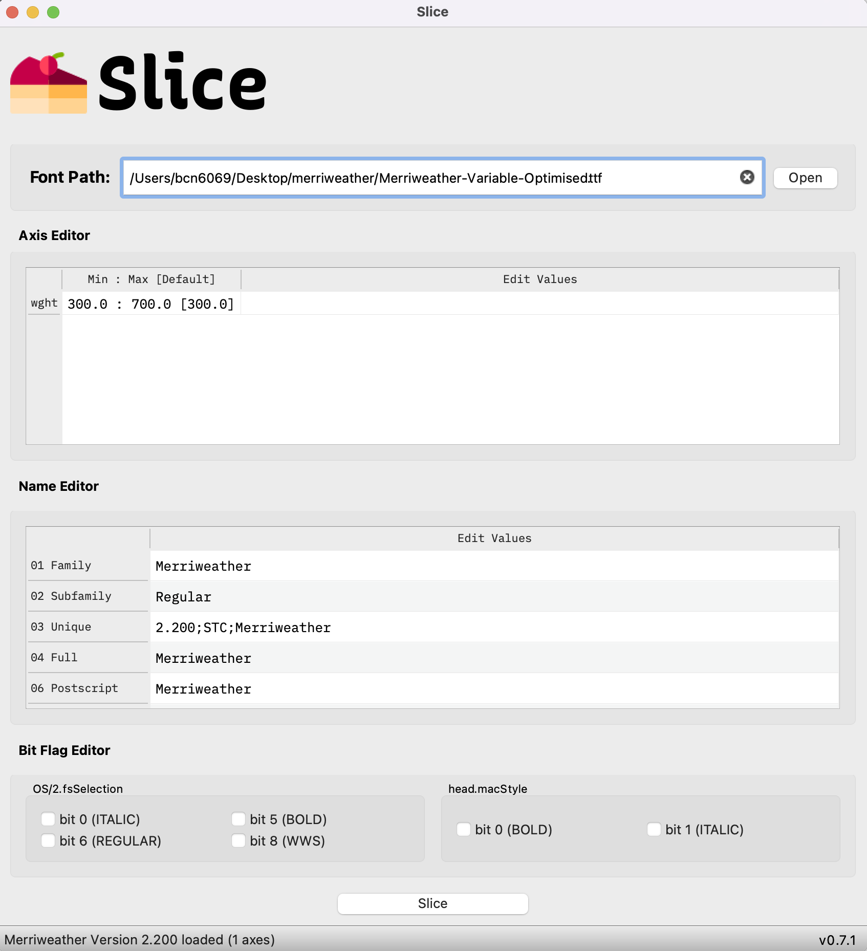
Which reduced the TTF file size of the Merriweather Variable font from 1.2MB to 544kB 🎉
Note - you have to use TTF format when doing this, as that format is required for the next step.
Step 2 - subset your font files into different character sets
What character sets do you think it would be beneficial to break your font down into? You can slice the font up any way you choose by declaring exactly which unicode characters comprise each character set.
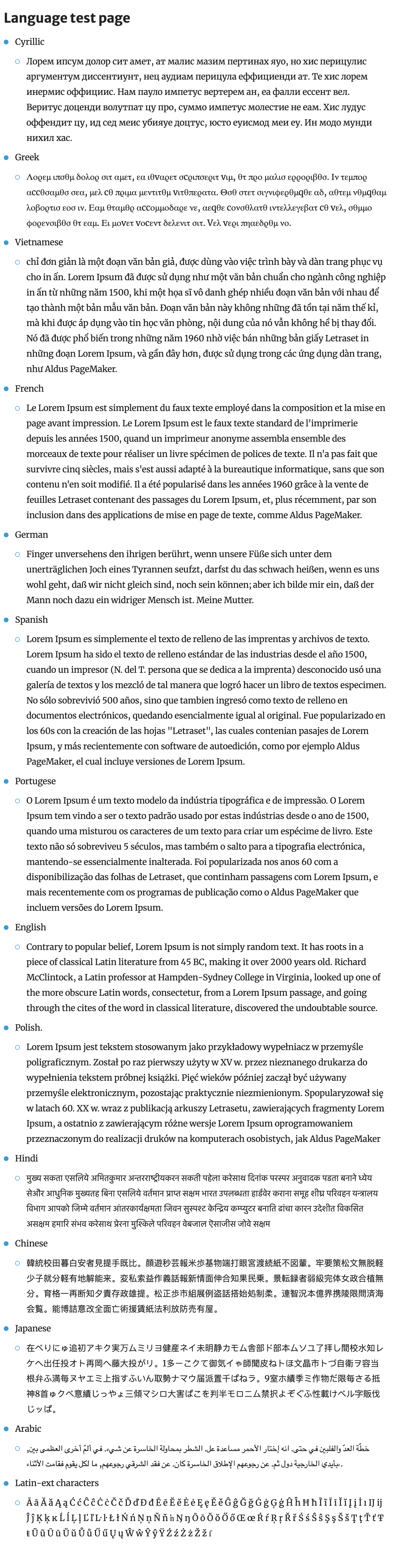
In our case, I followed the approach used by Google. Google Fonts consumers are provided font files that have been subsetted into the following character sets:
- Latin
- Latin extended
- Greek
- Greek extended
- Cyrillic
- Cyrillic extended
- Vietnamese
Here’s an example hosted by Google: The Roboto webfont
I used the CLI tool glyphhanger to subset the fonts. It’s simple to use, takes a TTF format source file, and outputs to all formats, including WOFF2 - which is the format we prefer.
Here’s an example of me using glyphhanger CLI to subset the Merriweather Sans font into a latin subset:
> glyphhanger --subset=MerriweatherSans-Variable.ttf --flavor=woff2 --whitelist="U+0000-00FF, U+0131, U+0152-0153, U+02BB-02BC, U+02C6, U+02DA, U+02DC, U+0304, U+0308, U+0329, U+2000-206F, U+2074, U+20AC, U+2122, U+2191, U+2193, U+2212, U+2215, U+FEFF, U+FFFD"

Subsetting MerriweatherSans-Variable.ttf to MerriweatherSans-Variable-subset.ttf (was 260.27 KB, now 146.88 KB)
Subsetting MerriweatherSans-Variable.ttf to MerriweatherSans-Variable-subset.zopfli.woff (was 260.27 KB, now 59.51 KB)
Subsetting MerriweatherSans-Variable.ttf to MerriweatherSans-Variable-subset.woff2 (was 260.27 KB, now 50.72 KB)
Step 3 - update your @font-face declarations
Now that you have different character set font files, you need to tell the browser when to load them. You can do this using the unicode-range CSS descriptor. The browser knows what unicode characters are present on the page, and so by defining the unicode range applicable for your @font-face rule, only the @font-face rules that are needed are loaded! :tada:
Here’s an example:
/* latin-ext */
@font-face {
	font-family: 'Merriweather';
	font-style: normal;
	font-weight: 700;
	font-display: swap;
	src: url("/oscar-static/fonts/merriweather/subsets/latin-ext/Merriweather-Variable-Optimised-latin-ext-subset.woff2") format('woff2');
	unicode-range: U+0100-02AF, U+0304, U+0308, U+0329, U+1E00-1E9F, U+1EF2-1EFF, U+2020, U+20A0-20AB, U+20AD-20CF, U+2113, U+2C60-2C7F, U+A720-A7FF;
}
@font-face {
	font-family: 'Merriweather';
	font-style: normal;
	font-weight: 400;
	font-display: swap;
	src: url("/oscar-static/fonts/merriweather/subsets/latin-ext/Merriweather-Variable-Optimised-latin-ext-subset.woff2") format('woff2');
	unicode-range: U+0100-02AF, U+0304, U+0308, U+0329, U+1E00-1E9F, U+1EF2-1EFF, U+2020, U+20A0-20AB, U+20AD-20CF, U+2113, U+2C60-2C7F, U+A720-A7FF;
}

/* latin */
@font-face {
	font-family: 'Merriweather';
	font-style: normal;
	font-weight: 700;
	font-display: swap;
	src: url("/oscar-static/fonts/merriweather/subsets/latin/Merriweather-Variable-Optimised-latin-subset.woff2") format('woff2');
	unicode-range: U+0000-00FF, U+0131, U+0152-0153, U+02BB-02BC, U+02C6, U+02DA, U+02DC, U+0304, U+0308, U+0329, U+2000-206F, U+2074, U+20AC, U+2122, U+2191, U+2193, U+2212, U+2215, U+FEFF, U+FFFD;
}
@font-face {
	font-family: 'Merriweather';
	font-style: normal;
	font-weight: 400;
	font-display: swap;
	src: url("/oscar-static/fonts/merriweather/subsets/latin/Merriweather-Variable-Optimised-latin-subset.woff2") format('woff2');
	unicode-range: U+0000-00FF, U+0131, U+0152-0153, U+02BB-02BC, U+02C6, U+02DA, U+02DC, U+0304, U+0308, U+0329, U+2000-206F, U+2074, U+20AC, U+2122, U+2191, U+2193, U+2212, U+2215, U+FEFF, U+FFFD;
}
Tip - the order of your @font-face declarations is important. Order them with the least often used at the top of your file and most often used at the bottom. This is due to the way browsers find the first applicable @font-face rule when there are overlapping unicode ranges (intentional or accidental). As explained in the spec (https://drafts.csswg.org/css-fonts-3/#composite-fonts):
If the Unicode ranges overlap for a set of
@font-facerules with the same family and style descriptor values, the rules are ordered in the reverse order they were defined; the last rule defined is the first to be checked for a given character.
So in the case of the example above, I have put latin at the bottom of the file because that is the most often used subset.
Step 4 - test in the browser locally to see if everything is working
Set up a test page, open up your browser developer tools and check everything is working as intended.
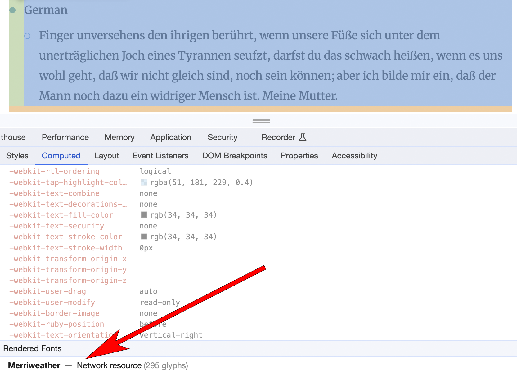
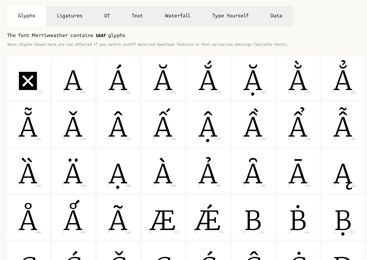
In addition to this, you can also use tools such as Font Drop to manually test your subsetted font file. You can drag and drop your font into Font Drop and take a look at font’s metadata. This can give you the confidence you have what you need.
Font display
What is it?
This technique is about user’s perceived page load speed, and aims to improve their experience by optimising when text is displayed and which font is used to display it.
This concerns the CSS descriptor font-display that is declared as part of @font-face rules in your CSS. It allows us to tell the browser how a font should be rendered whilst the page is being loaded.
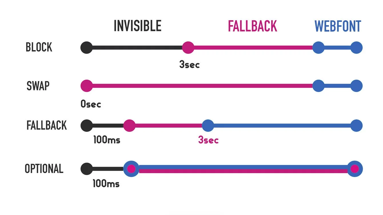
You have heard of the terms FOUT and FOIT?
FOUT – Flash of Unstyled Text: This is when the browser shows some initial font defined in your CSS for a brief moment, and then swaps to the fully loaded custom font.
FOIT – Flash of Invisible Text: This is when the browser doesn’t display any text until the custom font is loaded, and then replaces the invisible text with the desired font.
What we did
In our case, we have fallback fonts that we can define for Merriweather and Merriweather Sans that have a similar appearance (e.g. font-family: "Merriweather Sans","Helvetica Neue",Helvetica,Arial,sans-serif). We decided to display text in a fallback while the Merriweather fonts loaded, instead of users being unable to see any text (FOIT). It also helps that our fallback fonts take up a similar amount of space in the viewport for a given font size, reducing cumulative layout shifts when the font swaps from the fallback font to Merriweather or Merriweather Sans once they load. Something to consider.
By default, font-display is set to block. This tells the browser to wait 3 seconds (in Safari, indefinitely) for the webfont to load. Whilst the browser waits for the webfont to load, the text is not visible on the webpage. The text is there, taking up space in the viewport, but it is not visible (it is transparent). After 3 seconds of waiting, the browser will then display the text using the fallback font (for example, "Helvetica Neue" in the above-mentioned font-family declaration). The browser will continue to try and load the webfont for an indefinite amount of time and will switch the font of the text to use the webfont, if it loads.
We instead chose to set font-display: swap, which tells the browser to not wait at all. Instead, the browser displays the text using the fallback font immediately, then switches over to the webfont when it loads (no time limit).
We like this because the user is able to start reading text sooner, and because the fallback font has similar size characteristics to our web fonts, the page is not janking around (CLS) too much when the webfont loads.
Other things we thought about
Technically, the most performant setting is font-display: optional. This tells the browser to use a fallback font and wait only 100ms before either downloading the font in the background on low priority, or not downloading the webfont at all (if browser detects slow connection speeds). We suspected that for us this would lead to a significant proportion of our global audience not seeing the Merriweather fonts we use. After chatting to our designers and UXers about the value that the Merriweather fonts provide our brand and website, we decided that we preferred swap.
Another consideration for us was that we load our stylesheets asynchronously on our pages using Critical CSS. This means it will take longer for @font-face rules to be found by the browser, and therefore longer for webfonts to load. This provided more impetus for us to display text using a fallback font as soon as possible during page loading.
Here’s a handy visualisation by Roee Yossef from his Savvy blog article on font-display:
Do you even need your webfonts?
It’s worth having a chat with your designers and UXers to discuss the value that your webfont brings to your brand and website. Explain the web performance implications and considerations that have knock-on effects for user experience and SEO. Measure the loading time, size etc, of your webfonts. You might find that on balance they aren’t worth it and system fonts are fine!
Images
We used tools such as Pagespeed Insights and Speedcurve to identify areas that we could improve. We had findings such as:
- “Set an explicit width and height on image elements to reduce layout shifts and improve CLS”
- “Serve images that are appropriately-sized to save cellular data and improve load time”
- “Consider lazy-loading offscreen and hidden images after all critical resources have finished loading to lower time to interactive”
So we made a few changes to improve how we implement images on our pages.
Width and height attributes
A quick recap on Cumulative Layout Shift (CLS). As mentioned earlier in this article, CLS is a measure of how much the page content moves around while the page is loading. Think of that time where you tried to click a button but that button suddenly moved a fraction of second before you clicked it. Infuriating.
Before an image has starting loading, it takes up 0px of space. As that image starts loading, the browser discovers the image’s dimensions, and has to calculate the layout of the page again - and boom, infuriating jankiness.
By setting an explicit width and height on an image in HTML we can help minimise CLS.
<img src="/path/image-1x.webp" width="160" height="90" srcset="/path/image-2x.webp 2x, /path/image-3x.webp 3x" loading="lazy" alt="some alt">
<picture>
    <source media="(min-width: 1024px)" width="300" height="200" srcset="/path/desktop-1x.webp, /path/desktop-2x.webp 2x, /path/desktop-3x.webp 3x">
    <source media="(min-width: 480px)" width="200" height="100" srcset="/path/tablet-1x.webp, /path/tablet-2x.webp 2x, /path/tablet-3x.webp 3x">
    <img src="/path/mobile-1x.webp" width="160" height="90" srcset="/path/mobile-2x.webp 2x, /path/mobile-3x.webp 3x" loading="lazy" alt="some alt">
</picture>
The above snippets show width and height attributes applied to images. Note that you are able to use width and height on responsive image implementations like <picture> elements. It is valid to define the attributes for each <source> element.
The space has been reserved from the beginning of the page render, and thus your CLS will be minimised.
What about if I don’t know the exact dimensions? What about if I style my images with width: 100%; height: auto? That’s okay! Because the image styles in your stylesheet will override these attributes when the stylesheet loads. It is better to define something close what you think the dimensions will be than nothing at all. It still reduces CLS scores.
Do you use “critical CSS” on your pages? If so, bear in mind you can define the initial width and height in the critical CSS instead of HTML attributes. You will reduce CLS doing that, but I personally think defining it in HTML is a consistent, foolproof approach, and worth getting used to.
Responsive image techniques
Loading an image with intrinsic dimensions that are appropriate for the viewport/device rendering them means we don’t force users to download large files unnecessarily. This is good for user experience and for web performance.
srcset
The srcset attribute is very useful here. Essentially, it allows us to define a set of rules that tells the browser which URL to use for the image src and under what conditions.
For example:
<img src="header.png" width="160" height="90" srcset="header640.png 640w, header960.png 960w, header1024.png 1024w" loading="lazy" alt="some alt">
The above means load header1024.png if the viewport has a width of at least 1024px. Otherwise, load header960.png if the viewport has a width of at least 960px. Otherwise, load header640.png if the viewport has a width of at least 640px. Otherwise, load header.png.
Here’s another example with a different configuration:
<img src="photo.jpg" width="160" height="90" srcset="photo-retina.jpg 2x" loading="lazy" alt="some alt">
The above means load photo-retina.jpg if the device’s screen has a sufficient pixel density (2 device pixels for every CSS pixel). I recommend reading this guide on pixel density, which describes it within the context of the implementation of images.
Something to bear in mind with this is that you need to provide images with larger dimensions for 2x, 3x, etc. For example, if your image is 100px x 100px, then the 2x version you supply for it should be 200px x 200px. And your 3x image should be 300px x 300px. Even if you intend to display it in the viewport with width: 100px; height: 100px CSS.
As a sidenote, I also recommend looking into the sizes attribute. It expands on the srcset declaration and allows us to tell the browser how much width the image element will take up in the viewport. This allows the browser to make a better decision on which image file to use.
<picture>
The <picture> element gives us the same powers as <img>, with srcset and sizes attributes available, but goes a step further and allows us to define images that have different aspect ratios at different viewport sizes. This can be useful if your UI feature has a different design at different viewport sizes or device.
There is an added bonus in that we are also able to define different width and height attributes at different viewport sizes too.
<picture>
    <source media="(min-width: 1024px)" width="300" height="200" srcset="/path/desktop-1x.webp, /path/desktop-2x.webp 2x, /path/desktop-3x.webp 3x">
    <source media="(min-width: 480px)" width="200" height="100" srcset="/path/tablet-1x.webp, /path/tablet-2x.webp 2x, /path/tablet-3x.webp 3x">
    <img src="/path/mobile-1x.webp" width="160" height="90" srcset="/path/mobile-2x.webp 2x, /path/mobile-3x.webp 3x" loading="lazy" alt="some alt">
</picture>
In the above, you can see that at mobile a 16:9 aspect ratio image is defined. At tablet it’s a 2:1 aspect ratio image and at desktop a 3:2 aspect ratio image. And for each we provide a range of image dimensions in the srcset declarations to support different pixel densities.
I could go further and define sizes for each as well, as that is supported.
I quite like defining <picture> elements in my Handlebars templates for reusable components because I feel it gives them maximum flexibility. It’s not often you need to define different aspect ratios at different viewport sizes, but the option is open if needed. Plus, I like the fact you can define width and and height attributes per <source>, allowing CLS to be minimised appropriately at different viewport sizes.
Other worthy mentions
Lazy-loading images
A quick win is to put loading="lazy" on your images which is now widely supported. This can be used on <iframe> elements too.
Use an image transformation service
When implementing responsive images, you end up in a position where you need to produce and host lots of different versions of an image. If this is done manually, it takes a long time, and may end up being impractical at scale. That’s where something like an image transformation service comes in.
Springer Nature has Spindoctor (private repository), which is used by our main content platforms such as SpringerLink and Nature. We are able to send a request to Spindoctor for a version of an image with particular dimensions, and Spindoctor will return that image fully optimised. This means one source image, but infinite transform possibilities! Mwuhahaha.
This makes responsive image techniques more of a possibility at scale. And it also helps reassure you that all your images are optimised.
If you do need to do some manual image optimisations though, I recommend the excellent Squoosh app.
Find this post useful, or want to discuss some of the topics?